Contact form

Full form http://d.pr/i/gi1r You're definitely moving in the right direction Ben, I have a few things for consideration:
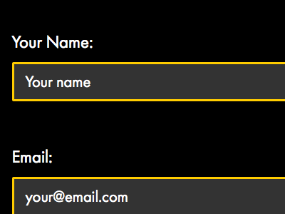
Placeholder text - is generally a bad idea, it causes more problems that it solves. People can confuse it with default options, un-editable areas, they can forget to update it. If you use data which could be real, for instance putting 'John Smith' in the name field. If the user leaves it as 'John Smith' do you allow the form to be submitted? Have they forgotten to change the name, or are they called 'John Smith'?
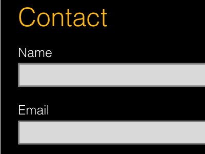
Input field background - with a dark background I don't think the fields look as much like an input as perhaps they should. Traditionally we grey things out because you can't use them, I'd be concerned users might make that association. Also dark grey on black doesn't really stand out very much. A white background just looks more like an input field to me.
Input field border - the yellow border on each field feels like a bit of an overkill to me and just doesn't quite sit right I don't think. Also surrounding the inputs in yellow could cause confusion with error messaging. I went for a dark grey border to draw a bit more focus to the inputs.
Phone number - ideally you'd drop this field, do you really need it? If so, then think about reducing the length. A phone number wil be 12ish characters, so why make the field big enough for 40 odd? Making it smaller not only matches what the user is expected to input but also helps focus attention to the message field as you scan down the form.
Colon - grammatically I guess they should be there, but I don't really think it makes that much of a difference to the form. I just quite like the cleanliness of not having one.
Well this turned into a bit of an essay, I hope it's at least of some help to you.