Why Not?

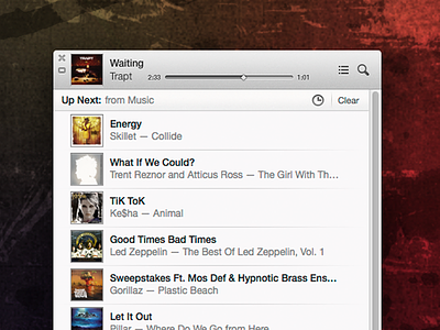
First off I did not design the iTunes interface, but I've been using it a lot and am plagued by this nagging question. Why didn't apple include a stupid time remaining bar on the small list view? It took me all of 5 mins to quick throw something together and if I took more time I could play with different layouts, spacing ect. to make it feel completely natural. It seriously seems like a slight mistake in my mind.
Disclosures: I claim no credit for the initial design, I only added what should have been included in the first place.