GQ Homepage Redesign


Just recently GQ redesigned their website, being a subscriber of their magazine and a fan of their brand I felt the new design fell short.
The new design wasn't a drastic change, but I feel like they didn't make any moves ahead to really make it a substantial milestone.
In my view their site is still behind the times and the site already looks outdated.
I wanted to keep it my design simple;
2 colours #f14247 & #2e2e2e
2 fonts Bebas Neue & Lora Reg/Bold
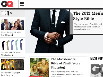
Attached is the full-sized hover states for the main menu and sidebar interaction.
What do you think - which design do you prefer?