GA Monogram Identity Design

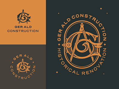
Here's my biggest regret of 2019. This was designed for a historical renovations company with the letters G and A in it, with G being a historical letter mark and A being a caliper to signify the work precision. I had to change the name, because the client ended up ghosting me, leaving this lovely mark unused. I made a more complex version for bigger use and a simplified version for web and smaller use.
Hope you like this and if you do don't forget to press L and follow for more stuff.
Happy 2020, hope this will be a good year!