


FiveSix: App Icon

Brand Exploration 2/4:
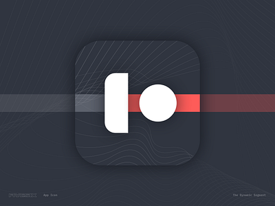
The app icon summarizes the main component of interaction within the FiveSix experience: the slider that allows choreographers to define the start/end of their playback, and the scrubber that reveals when the track plays.
The composition subliminally resembles a "play icon" as a side-effect. The left of the slider resembles the full track, and the coral colored right side of the slider resembles the segment that is currently being played.