Photography UX

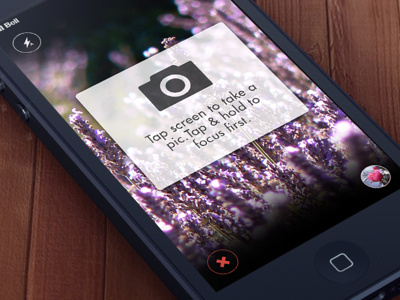

"Tap to capture. Hold to focus." Look at this.
A new photography UX concept.
What do you think? Criticism welcome.
I'd like to create an immersive, incredibly easy photography UX -- an experience where I'm not distracted from taking the photo by having to find and tap the (relatively small) button in the tab bar.
I added a soft gradient on the top and bottom to remove the sharpness of the black borders around the 4:3 image.
UPDATE: Changed the copy and changed the red 'x' to a blue back arrow based on user testing. I also changed the shapes of the nav bar buttons to rectangles and kept the buttons that affect the camera (e.g. flash) as circles to provide a visual distinction. Finally, I removed the opaque rectangle from behind the coach mark, because I found that users thought they had to tap within that particular area on the screen in order to take a photo, and I want to make it clear that they can tap anywhere on the screen. Check it out!