


usage metrics graph

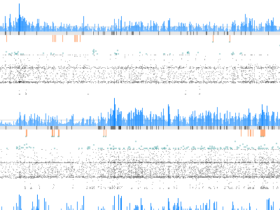
a take on re-doing the graph from my previous shot; we recently hired someone who is red/green colorblind and they couldn't see the 'failures' in red over the quantity value in teal, so I'm attempting to distinguish better. I'm not *entirely* happy with this new format, but it gives us greater vertical density.