Q Letter Logo Grid
Hey guys!
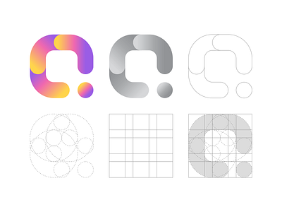
Here is logo grid of previous concept for a creative software company. This is what the logo is based on, its structure, geometry & anatomy. I hope you will find it interesting and useful.
And as always, I will be glad to your comments!
Thank you)
abstract
behindthescenes
clean
creative
creative studio
gennady savinov logo design
geometric
gradient
logo anatomy
logo design
logo grid
logo presentation
minimalistic
minimalistic logo
modern
q letter
q logo
symmetric
View all tags
Posted on
Dec 11, 2019
More by Gennady Savinov View profile
Like