


Resultime - Press Release

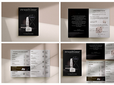
The approach for this deep subject was a little different than usual. Using the early methods of design thinking and placing the consumer at the centre of the design strategy. Women wanted more radiance, and a high-end brand with technical responses to their anti-ageing issues. It became obvious that the use of contrasting fonts, such as serif style and a scientific kind of type associated with an elegant black synonym of maturity and premium look, evolving to a luminous beige radiancing and feminizing the brand were going to be the start of a response to our brief.