Craigslist Re-branding:

The simple, purple 8-bit peace sign on Craigslist's homepage tab represents the success of Craigslist in the peak of the 90s Internet era. There was so much possibility, and so much connection happening both locally and globally. Since then, a lot has changed on the web.
To keep up with this change, we decided to take inspiration from Craigslist’s simplicity while adding a youthful, modern twist to keep the brand relevant and unique within today’s digital market.
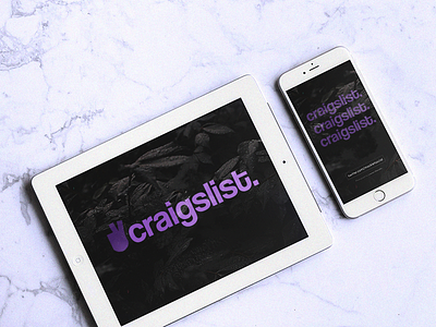
Craigslist relies on the constant traffic of people to post and browse, which is why we decided to transform the classic peace logo into a human hand.
The hand highlights the sense of human interaction and “grassroots community” that keeps Craigslist successful.