Wdech studio - branding

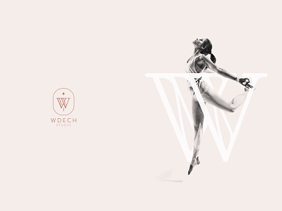


Wdech Studio - branding
BRANDING PROJECT FOR AERIAL YOGA AND PILATES STUDIO - TRULY UNIQUE PLACE ON THE MAP OF WARSAW. OBJECTIVE? TO CREATE VISUAL REPRESENTATION OF BUSINESS' CORE VALUES.
The main goal was to establish a visual strategy and design visual identity based on a deep understanding of both business goals and the target group needs. In the design process we established the ideal customer profile, a pyramid of their needs and expectations towards the brand.
On this basis, an identification was created that reflects the nature of the company. Visual elements reflect the needs of the studio’s customers.
Wdech means’ inhale’ in Polish. Breath is the beginning and end of everything. It also has a very important role in the practice of yoga.
Identity is based on a combination of three elements – balance, joy, and strength, which at the same time refer to the three main aspects that are influenced by practicing in a yoga studio – taking care of the mind, body, and soul.
These three elements have been reflected in the color scheme and key visuals.