Crystal Horton Group | Rebrand
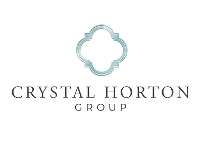
Crystal Horton came to us at FingerPulse Media to rebrand her real estate group business. She wanted to keep the same colors but wanted her image to look more professional, luxurious and modern.
We first sent her countless of concepts for her new ornament design and she ended up going with the same style but with an elegant feel. With that style in mind, we wanted to mimic that idea with fonts. We then worked on the font game and decided a serif font for her name and a sans serif font for "group" would look great with contrast. Crystal approved the overall design and we went ahead to design her a luxury logo. It has the same style but with a luxurious feel.
brand identity
brand identity design
brand identity designer
logodesign
logo design
logodesigner
rebrand
View all tags
Posted on
Dec 9, 2019
More by Arlina Roman View profile
Like

