


VM

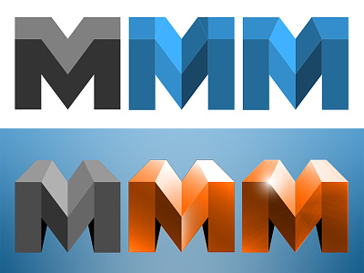
progression for a logo / icon that wasn't used. the letters were V M, but towards the end the V wasn't readable enough. but i still like it on it's own.
progression for a logo / icon that wasn't used. the letters were V M, but towards the end the V wasn't readable enough. but i still like it on it's own.