BOTANIQ Baby


Full project is here
Botaniq is a new player on the Russian washing powder market. The main values of the company are eco-friendly and natural. So, they have come to me to develop a visual language of their company. Specifically, logotype and packaging design.
Task
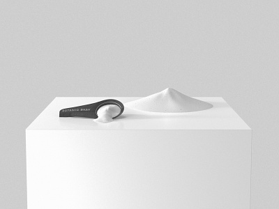
Guys from the Botaniq wanted to show that their product is eco-friendly, natural and also produced with love and care. As a young company, they asked me to create packaging, which will be made with craft paper and be cheapest as it is possible. It means one or two colors without big filled squares and to use the easy and trivial shape of the packaging. However, they wanted to stand out of the competitors on the shelves. It was necessary to find a compromise. The product will be for the babies and should show that for potential consumers.
Solution
My decision was to go out of and collect fallen fir branches. Then in a comfortable environment, I compiled the brand name using the fir needles. It is impossible to make a perfect font of them, plus there is my human factor. Total we get imperfect writing of a logo with strange letters. There is life in it. We got really eco, natural and handmade logotype. Also, I used the sidewalk chalk drawings as an inspiration to create graphics for the packaging. It is a good way to show the children side of the product.
P.S. Neither fir branches have been suffered.
P.P.S. Child labor was not used.
Contact me to suggest your project:
Dribbble | Facebook | Behance