Responsive Natwest Redesign (Retina) #2


Please view the full size retina pixels!
As promised, here's the revised version of my original Natwest Online Banking redesign. I've made several changes that I think have greatly improved the experience:
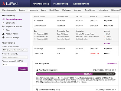
1. Moved left sidebar links to the top nav bar, and have hidden other areas of the Natwest site (these show when the user isn't logged in).
2. Removed second nav bar (our products) and placed in the right sidebar.
3. Aligned balance and available balance figures to the right, for easy calculation.
4. Changed the saving goal progress bars colour scheme from purple to blue so not to confuse what you can click and what you can't click.
5. Added a nifty little calculator in the left sidebar (something which would come in really handy!).
------------------------------------------------------------------
Why I redesigned the Natwest Online Banking website
I use the Natwest website every day. Being self-employed, it is important to keep track of client payments as well as my personal and business expenses. Admittedly, I find the service works really well. It's reliable and easy to transfer money between your accounts. It is however a little outdated, and there were several things I wanted to change.
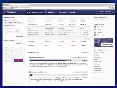
One of the main things I wanted to fix was the width of the website. It doesn't respond to your browser, leaving a huge white gap between the right side of the content and the right side of your display, even on a 15" laptop screen. I wanted to fix this with a responsive site that looks good on anything from an iPhone, iPad, laptop or huge 27" cinema display.
One of the other main things I wanted to change was the navigation bar. Currently the Natwest website shows all of their product links at the top of the site, even if they are not at all relevant to the customer. I hid these away below the fold in the right navigation bar. After all, you're logged into look at your accounts; you're already a customer, and if you want a new products chances are Natwest would be your first choice. This means the three items in the nav bar were left as Account Summary, Statements and Payments & Transfers; three areas of the site you're definitely going to use when you are logged in.
Other than these two big changes, I tidied up the interface a lot, making it more modern, smarter and easier to use, making the users experience a pleasant one!