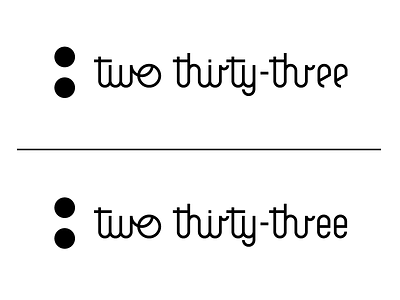
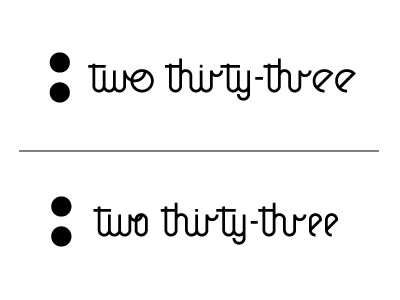
two thirty-three - WIP_03
And then there were two... Not going to lie we have been pretty happy with this whole logo concept except the damn e's. So we narrowed it down to two different versions. We decided to go with the condensed version of the 'e's because the full circle version just didn't feel right and made for some uncomfortable gaps. Feedback is more than welcome.
View all tags
Posted on
Dec 28, 2012
More by Bob Ewing View profile
Like


