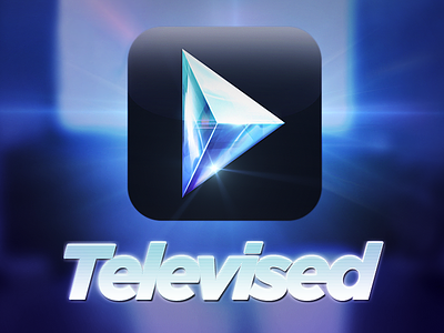
Televised

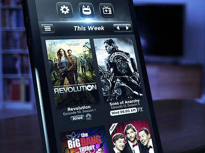
Here's a closer look at the interface for our new app, Televised.
Visit the site ☛ televisedapp.com
Direct iTunes link ♫ itun.es/i6D42FP
I thought i'd write up a few thoughts on the design we ended up with. When we initially started working on a "TV themed" app it became apparent that many of the existing design directions within that concept took on the approach of a vintage TV. There's a lot of old classic wood-paneled TV icons and interfaces out there, and even though we haven't been shy on the wood before, it somehow didn't resonate with us for this particular task. To me, watching TV today is something fairly high tech. I watch episodes streamed on the internet through services like Netflix or Apple. It's served through my AppleTV and gets displayed on my flatscreen LCD, no wood paneling required! So the direction we took with this was more modern, using materials like black glass and cold precise lighting - much like a top-of-the-line flatscreen television today. The challenge was then to create an interface that was mostly about the content and would create a clean experience while still retaining that sense of character that we always try to imbue our products with. A lot of it was achieved with subtle lighting and animations, like the flare in the menu, the static noise in the episode summaries or the way the episode "cards" flip into place when you open and close them. We had a sound engineer help us out with the soundscape and it really augments the entire experience.
You can see it all in action in the video i put together on televisedapp.com. I'm fairly new to after effects, but after many sleepless nights of rendering I finally got it in the vicinity of what i had in mind. x)
___
Get My Industry Standard Design Resources
at 📐👉 applypixels.com
Premium Evolving Icon & UI templates (& a bunch of freebies)