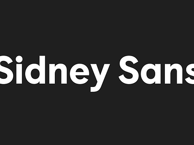
Sidney Sans
Sidney Sans
A custom geometric typeface designed for Myer, one of Australia's largest retailers. During my time at Myer I helped art direct and finesse 3 typefaces, one of those being Sidney Sans.
The goal of this typeface was to create a stylish yet readable sans serif that was hero'd by its accessibility.
We focused on the a, e, l and u characters. We worked hard to make sure these were drawn with accessibility at the fore-front. Increasing apertures, adding terminals and introducing alternatives. We had users with low vision review the draft typeface to make sure we hard fine tuned all areas.
The result was an elegant and accessible typeface perfect for balancing form and function. We worked with The Design Foundry to create the Sidney Sans typeface.


