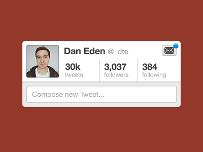
Great playoff.
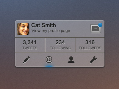
I wanted to stick to Twitter’s actual design with this, but definitely wanted that Direct Messages button somewhere more accessible.
Reasoning behind a few other tweaks:
Dropped “View my profile” – most users will know clicking on a name or avatar links to their profile anyways
Bigger numbers – a bigger ego is a healthy ego. Right? Or something like that.
Bigger face – who doesn’t want a big ol’ face?
One last thing, and I say this because I thought about it while I was browsing the other rebounds of this shot: why do people jump at the opportunity to dramatically redesign an interface? You have no idea the processes that were involved to lead to the original design. Ideas you’re trying may well have been tried and lead to a dead end. Don’t assume your idea is original or better. And definitely don’t be afraid of criticism that your idea is actually worse for users than the original.
That’s all. I hope I don’t start a flame war by saying that. It’s all part of the ongoing unsolicited redesigns debate.
EDIT: this took me much less time in HTML/CSS than it did in Photoshop. Check it out.