ReCharge logo revamp

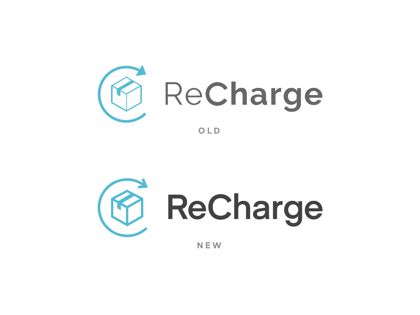


ReCharge has certainly evolved since its humble beginnings, and the design team felt it was time for the logo to do the same.
Some issues we addressed were: - Inconsistent line thickness and illegible details in the mark - Uneven font weight in the logotype - The logotype itself
We feel the new logo better reflects who we are—authentic thought leaders in the subscription space.
This project was 100% a collaborative effort with https://dribbble.com/kaylene_finch.