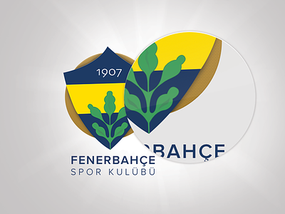
Fenerbahce logo and jerseys redesigned
About football club logos
First off, I want to say European football clubs, or as Americans say soccer clubs each have over hundred years of history, and most of them go back to World War I, World War II. They're not only sports clubs, but they have been movements for their respective countries. So their logos/emblems usually rely on so many things and every stroke most likely have a meaning.
About this logo
Fenerbahce is a Turkish sports club that was founded in 1907. Original logo goes back to 1910 when one of the football team's "artsy" players Hikmet Topuzer actually drew the emblem himself. Navy color represents nobility, yellow stands for their opponent's envy. And finally the green oak leaf represents Fenerbahce's growing strength.
I wanted to keep the main elements and without losing it's meaning I wanted to simplify and modernize the emblem a little bit. But of course, designing a 105 year old football club's logo ain't that easy.
I also always wanted to design a soccer team's jersey, so I went head and did that too. Make sure to check out the attachment and let me know what you think.
You can also follow me on twitter as well.


