


Before and After: Endeavors Identity

"Endeavors" is the 35 year old online, digital research magazine for the University of North Carolina at Chapel Hill. Originally, the publication was a print piece, however, was cut down to just an online source in 2012.
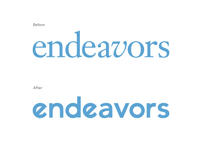
In 2019, the Office of Research Communications participated heavily in the event University Research Week, a week long celebration of research across campus. To celebrate all things research, a limited print run of "Endeavors" was released, highlighting works from the 2018 - 2019 academic year. The "Before" logo has been around for 13 years and with the modern look becoming much more apparent in the office (via website and e-newsletters) we thought a logo redesign would be appropriate.
Talking with the original artistic director/editor of "Endeavors" during their 1995/1996 redesign, he explained the process they went about creating their logo. Using the typeface "Janson," they were able to to evoke a fresh, classical logo, fit to represent the university. When I inquired about the italicized "v," the response I got was "I thought the word, 'endeavors,' was just too long, so the 'v' acted as a wedge to break up the word, also give it something a little more interesting."
Sticking with the idea of the slant and carrying over a much more modern look, I created the "After" custom workmark. Sticking with the all lower-case idea, yet showing that fun, playful side with the slanted 'e' (and paying homage to the 'v' in the original). It's clean and slick, academically appropriate and ready to present the wonderful research coming out of UNC-Chapel Hill.