New Post button

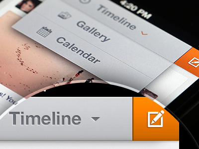
Playing around with some styles for the Feed screen. We decided to move the Post button to the top bar so that it doesn't overlay the feed. Also you now can choose how to view the feed - as timeline, collection of items or just photos.
Still thinking which arrow works best - tiny orange or more standard grey one.
Real pixel piece is modified slightly for you guys so that more details are visible.
***
More to come!