Product Details Page - Mobile Responsive

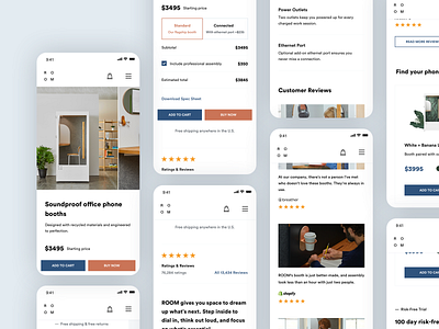
By embracing the values of mobile responsiveness, ROOM's redesign concept guarantees that the website and details page provides a consistent, user-friendly, and visually appealing experience across a range of devices. Whether accessed from a desktop or mobile device, potential customers can effortlessly engage with the content, make informed decisions, and seamlessly navigate the website, ultimately driving conversions and fostering a positive brand impression.
Mobile responsive design ensures that all the essential information, including product features, specifications, pricing, and customer feedback, is accessible and easily readable on smaller screens. legibility, intuitive navigation, and touch-friendly interactions, optimizing the user experience for mobile users.
Furthermore, mobile responsiveness contributes to improved search engine optimization (SEO) and discoverability. As search engines increasingly prioritize mobile-friendly websites in their rankings, having a responsive design enhances the website's visibility and potential reach, driving organic traffic and attracting more potential customers to explore the telephone booth products.
