Samsung Rebranding

First of all, this playoff series was a great idea!
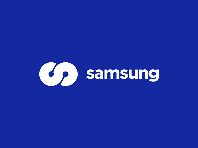
The Samsung logo has always seemed weird and disjointed to me. The font looks out of touch and outdated, and the oval shape it's set in looks off-balance (I always visually feel like it's about to roll to the right) and always looks odd on their devices. What cool stuff they make is blemished by that logo.
I wanted to know more about the Samsung brand, and a quick Wikipedia search showed that the name means "three stars," which symbolize power and eternity. I developed this mark to resemble 1.) an "S", 2.) an infinity symbol, and 3.) a subtle abstract of printed circuits in the negative space. While it may look simple, a lot of effort went into building the logo geometrically. I think this logo would be a lot better to mold into their devices than an oval with the word "SAMSUNG" inside of it.
As stated by previous participants, not trying to step on any legal toes here; this was simply an exercise.