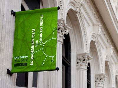
Exhibition Branding
For a fictional exhibition. The initial exhibition logo I created focused on connection; connecting people and connecting the dots to discover new ideas. I looked at diagrams of plant cells and atoms to visualize connection in nature and those common in science teaching. The repeating “o” in the title was a useful tool to illustrate connection and a visual element that could be easily versatile for other elements.
After the logo was finalized, I built a branding suite that would support the themes of connection, science, and learning. Colors and type were designed to be bold, modern, and exciting. The green leaf image became a secondary visual element to indicate nature and science along with the connecting circles.
View all tags
Posted on
Nov 12, 2019
More by Amanda Lucius View profile
Like

