iMessage concept

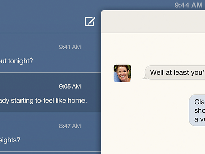

I started with making some mockups on how I would like iOS to look like. I began with iMessages.
The concept is that most apps will contain two main layers. The lower layer (in this case blue) is flat and clean. No shadows, textures or anything. The colour would change per app, giving it it's own identity. The status bar is not separate anymore, and thus one with the lower layer.
The upper layer is where it all happens. It has some depth, although not as much as most current iOS apps. The white is a bit tinted to make it more human and paperlike, and would be uses throughout the OS.
Download the attachment for your (Retina Display) iPad. Any feedback is welcome!