Stipple Logo Refresh

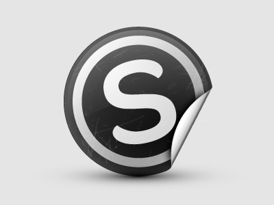
The company that I work for Stipple, today announced $2M in funding. This is the "re-aligned" logo. What's been updated is switching from Helvetica to Omnes for the "s", and thinning the white band. Our software allows you to put dots on images to add captions or link to people or products, kinda like a sticker. Hence the logo.