Nissan - flat design proposal

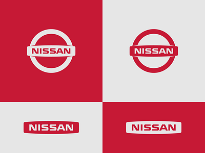
Being aware of the flat design trend, I tried to create a logo for Nissan, that is not too flat(and boring). So I introduced some cuts at the middle bar, which made the design feel more 3D.
Seeing the Nissan logotype on stadium banners at football games(the real football :), I felt that it could look better and more pleasant with some air to breath. I removed the circle to create a secondary, responsive design.
Thanks for stopping by!