Dotboost mark2

After a few discussion with the client we decided to drop the first logo for the smaller sizes problem. At small sizes (ie. favicon) the previous mark was too weak so we went back to the drawing board.
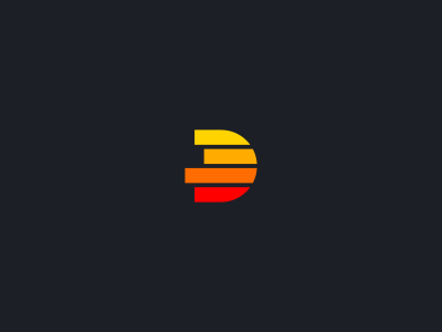
We still wanted to maintain the characteristics of the first one, growth, movement etc but to execute in a more solid way so that at small sizes we would have a strong image.
I opted then for thick lines that also form letter D and still give that sense of movement and growth through their different widths on the left part.
I am still trying a few variants of this, with bigger space between the lines and no space at all.