Blossom Trips Hotel Branding Pt 05

CB Design Production: Blossom Trips Hotel Branding Pt 05
Full project can be found on my Behance
Blossom Trips hotel is located near Lijiang, Yunnan Province, China. Lijiang is the closest thing you will get to a real wonderland. It is a beautifully preserved ancient Chinese town, infused with cultural flavour. Strolling along the 800-year-old bridges and waterways of the world-famous Old Town district is like stepping back in time.
Keywords: Modern Chinese, Tranquility, Relax, Enjoy, Raw, Nature.
We chose Chinese Character “花” (Flower) as the representative of Blossom Trips Hotel. In order to preserve its tranquility and oriental feeling, we trace back to ancient Chinese Character forms. Chinese Seal Character was used as the base shape of the logo. Simple geometric shapes such as square and circles are combined into the logo to add a modern touch.
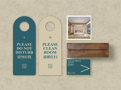
If we compare Blossom Trips to a drama, rough wood furniture and accessories no longer play their original roles. They become the carrier of time and the narrator of the story. When you walk into the "Blossom Trips Theatre", you can feel there is a dramatic moment of time travel, as if the rough wood furniture and accessories are telling you stories.
We certainly hope you like it. Thank you.