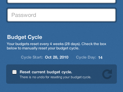
Spendly Account Update
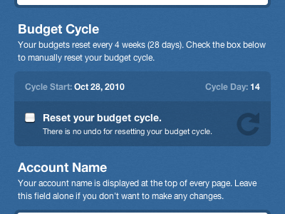
As always, some minor tweaks occurred while coding. I think the end result came out nice. The whole dark area with the checkbox and arrow is clickable. Could use some more space between the reset box and the account name section, but I'll fix that in post.
Full Shot: http://cl.ly/e95d3ba20dc66b25bb21