Let's not be square


Hi y'all!
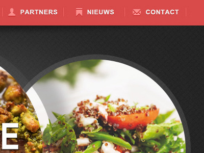
Here's a first draft proposal homepage for a belgian distributor of spices and (truck) loads more. (pun intended)
I kinda like how it turned out, it's clean and simple yet the wacky banner makes it sophisticated. Or something like that..
Could use an extra pair of eyes on the menu though. What I've done now is make the space between each icon and it's tag the same ( so, [icon][17px][word] ) and visually centered the two between the deviders. With me so far? Well, it looks messy. Or does it? Lemme know whatcha think.
Word out to Virgil Pana, Jeremy Sallée and Brankic1979 for the icons used in menu bar.
EDIT: I'll have to change the cursor icon in the c2a button to the shopping basket icon.