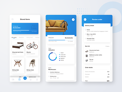
On-demand storage app

Hey guys!
Have you ever look back at your work which you did a few years back and thought - how could I make something ugly like this? Well, I guess that happens way too often with design folks. Recently I've been updating my portfolio and wrote a case study on building a mobile app for on-demand storage service in Singapore. I found so many areas for improvement when I look back at the project's design and UX. And I decided to redo some major flows and screens.
I found this a great way to reflect on your own growth. Definitely, it worth doing it more often to learn from your own mistakes. Check out my case study on Medium:
https://medium.com/swlh/designing-an-on-demand-storage-app-a-ux-case-study-81b1bc3e9d2e