Final QF monogram logomark for Qualifast


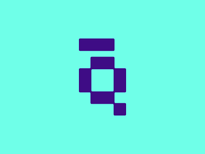
Hi! So this is the final logomark I crafted for Qualifast. Represents a monogram of Q and F, referring to the company’s name. Based on the impossible figures, the logomark indirectly suggests the company’s core function - making the impossible possible through software development and solutions.
Check out the full brand identity here
.
Completely another thing - I am looking for a motion designer for collaborations! If someone is interested, write me!
.
While I warm up my Dribbble play, you can check my work on Behance and Instagram.
.
If you have a design project you need help with, I'd love to hear about it! Contact me!