Oppero

Identity & Branding design for Operation Management Agency, 'Oppero'. ✍🏻
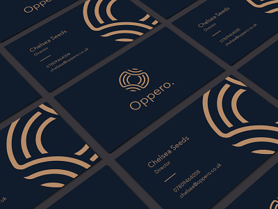
The concept we created uses a unique symbol; 2 circles intertwining to emphasise the links between the front of house and backend management of a business. Pastel colours are used heavily throughout in order to balance the design whilst giving the brand a more luxurious and clean cut aesthetic.