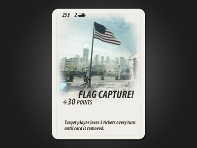
Game Card: Battlefield 3 (v2)
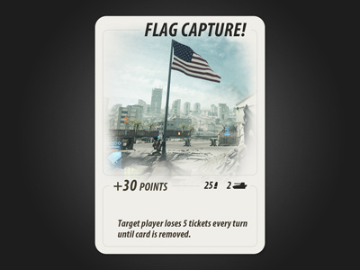

I thought that putting the name of the card at the top made more sense, but I think I prefer the aesthetic of the other version. Maybe my placement here is just poor compared to the screenshot? It would look better if the text and the flag had more space between them.