Jarrell Creative House One Pager

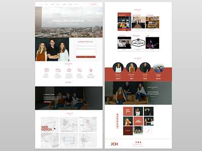
We wanted a clean design that showcased the personal, warm and energetic vibe of our brand. We chose a one pager for the sake of minimizing our information and to quickly bridge the gap between technology and our initial personal contact with clients. A hint of red orange contrasts the white and grey, and the design strategically displays our own imagery to capture our unique dynamic as a sibling trio.