Personal Page 1.2

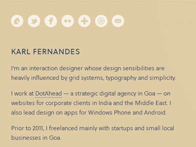
Going with a much warmer tone. The blue looked too cold, which is the opposite of what I wanted to communicate.
Modified the email icon to better suit the others. Created a Gimmebar icon as well to complete the set.
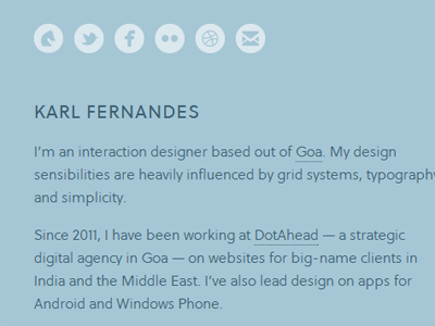
Going with a much warmer tone. The blue looked too cold, which is the opposite of what I wanted to communicate.
Modified the email icon to better suit the others. Created a Gimmebar icon as well to complete the set.