


Gusto Typography


A shot of Gusto's new typography as apart of our brand refresh ✨
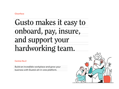
Our primary typeface for headlines is ITC
Clearface. It’s a personality-packed serif
that helps us stand out.
Our secondary typeface is Centra No.2,
a contemporary sans-serif that’s accessible
and unpretentious. It’s ideal for longer text
and product experiences.