


John Wick - A modern take

I recently watched John wick 3. one hell of a movie.
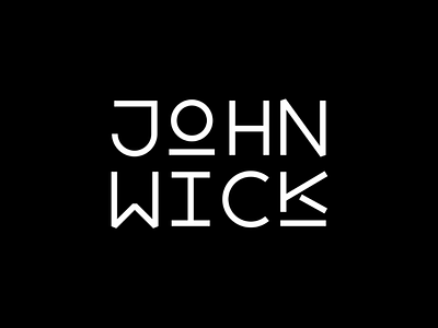
I couldn't get my mind off wondering from how John wick's name would look like if it was on a more modern and sleek font. now, I am not much of a typeface designer but I thought I'd give a hand at creating something from scratch.
while there are some nooks and crannies that need to ironed out, i think it came out fairly good.
what do you think? (btw, that broken k is what you get when you try to prove your fealty to the man above the high table)