Source List Border

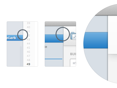
Something that's always bugged me a little about source list apps (Finder, iTunes, Mail etc) under any version of OS X, is the border that splits the source view from the main view. In some cases it makes for blurry edges and makes certain graphics (source selections etc) really tricky to marry up against that border.
In the new Mac app we've been working on, I've made this split border a shadow and moved it inside the source list. It strikes me as more elegant, serves the same purpose as the original, but means any graphics can sit precisely edge to edge.
Curious to see what people think!