Ambiente – app and mobile comparison

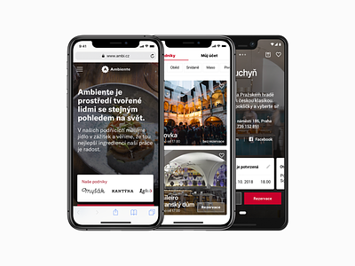


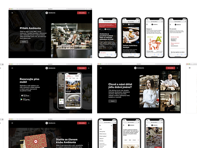
More mobile previews of the newest Ambiente website, where we wanted to create a design, that would continue the design style that we've created for a new mobile app we launched a few months back.
The goal was to make the website the middle ground and use some of the design solutions we used in the app, such as the lists of restaurants or some of the white mobile boxes that appear in the app.
Check the apps for iPhone and Android. here
–––––
Client: Ambiente Art director: Bohumil Vašák Author: Michael Dolejš Cooperation: manGoweb (development & consultation) Font: GT America
–––