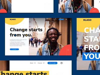
EXPLORATION-02: Online Course Feature

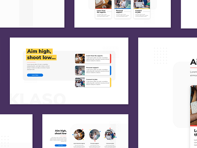


This time, it’s a feature section for a landing part. I was Inspired by an exploration by Dwinawan about the same topic, especially on the use of the “Learn more” button. Been questioning why would only a single button is placed on the section instead of three buttons for each feature until I realized that if the explanation for the features doesn’t take up more than just a single page, then it’s redundant to have three buttons on the same section just to access it. (Fajrul, at Inipagi)
———
Inipagi are Creative Muslim digital agency specializing in icon design, illustration, and interface design for brands.
We were established on 2014 and have been dedicating ourselves to deliver visual solutions for various needs. Working from our home in Yogyakarta, Indonesia, we bring up our values of fresh, fun, and professional for the whole world.
Web ● Instagram ● Facebook ● Icontellyou