Redesigned Hulu Mobile Details Page

Context
The content details page is important for every video streaming service. This is the page users see when they want to watch or learn more about a movie or TV show. Typical details pages can include things like show artwork, synopsis, ratings, duration, a list of episodes, related content, and more. They also tend to include actions such as play, save, record, download, and more.
On Hulu, the details page were designed primarily for living room TVs and then adapted for the mobile app. It also generally looked the same regardless of the type of content (movies, TV, sports, live, etc) and regardless of a user’s relationship to that content (never watched, partially watched, finished, etc). This project was an opportunity to make the details page more fluid and relevant for users on mobile devices.
Project Goals
Decrease the time it takes users to get to playback, especially for TV series.
Customize the details page based on the type of content it displays.
Redesign the details page so it feels native to mobile devices.
Design Process
The main challenge my team and I faced was deciding what information and actions to prioritize for a small mobile device screen. Based on research and product management input, we prioritized a list of all the potential information and actions we could show. We frequently checked in with development to understand what was and wasn’t technically feasible.
With these things in mind, we mapped out hundreds of different scenarios: a TV show a user has never watched, a TV show a user has watched some episodes of, a TV show that is also airing live, a TV show that is only airing live, a TV show that has been recorded, and on and on. From here, we began stress testing the initial designs to ensure they could work in every possible scenario. Eventually, we landed on a design that worked, continuing to make changes throughout development as new challenges and edge cases arose.
Design Solution
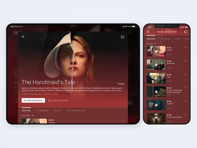
By the end of the design process, the mobile details page was thoroughly redesigned. It became a simple popover modal, giving it a lightweight and easily accessible feel. We prioritized the show artwork because we knew it was a main factor for users deciding what to watch.
We also added a large button to get users quickly to playback. The button can be a way to resume a movie, play the next episode of a TV series, or tune into a sports game that’s about to start. It changes depending on the type of content and a user’s relationship to the content.
If the button isn’t relevant, users can scroll down to instantly view more episodes. In this area, they can also swipe between different sections to see things like a schedule of what’s airing live, short clips, or other related shows they may like.