Vatix - Branding Guidelines


Last year i had the honor to work with the folks over at Vatix on their new brand identity.
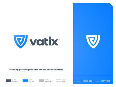
They are a technology company that creates both hardware and software to provide personal protection devices for lone workers.
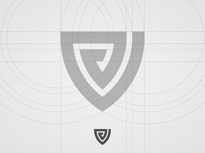
This concept resulted from the mix of the letter V with a shield to symbolise protection and security while the bold lines are meant to reinforce the strong look. Since there will be a lot of software involved, there's also that data encryption vibe on it 🛡
Press "L" if you would like to see more Branding Guidelines.
--
📨 Got a project? Let's work together! Email: wisecrafted@gmail.com
--