Daily UI #037 - Weather App

Thoughts
I feel the concept and functionality of a weather app have pretty much been nailed down. However, one aspect that could be explored more is aesthetics or delight.
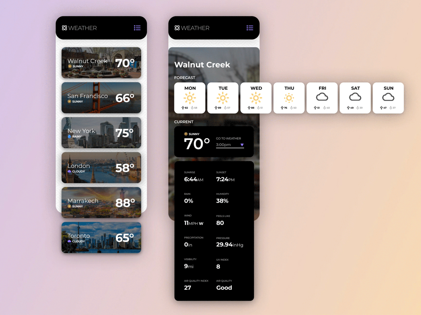
As the subject of this challenge, I wanted to redesign the Apple weather app. I use this app frequently and it works fine, but it is bland visually. My goal was to take their already properly functioning app, and make it a bit sexier.
To accomplish these goals, I decided to add exciting images to the BG of city cards, and animated gifs to the interface. Next, I rearranged how the user digests the information, to simplify the user flow. Also, I wanted to condense the number of temperatures shown at once, so I reduced that information to a drop-down menu. I kept the UI to a monochrome palette with very subtle icon colors, so the components don’t clash too much with the images of the cities.
Hope you like it! Enjoy!
-- -- --
Press L if you like my shot, and follow me if you want to keep track of my progress on the Daily Challenges! See you at 100. 😋👍
The challenge is to complete one unique User Interface design task every day, for 100 business days. You can read more about it here: https://www.dailyui.co/