Educational Platform Icon Set

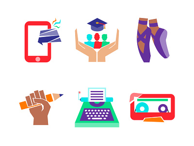
Just a small part of a huge icon set a did for a wonderful client of mine for her educational platform.
The set, I created completely from scratch with heavy Constructivism, Bauhaus and Suprematism design style influence - lots of rough geometrical shapes, empty/negative spaces, shape bursts, etc. Then I combined this look with a very modern colour palette, that uses bright electric colours for relevance, and a touch of provocation. The goal was to create completely unique look, that have strong roots, but would resonate with young people too (the target audience is 12-25 YO).
What do you think: are you fans of the classic styles, or you prefer more common gradient/line icons?