


UI Suggestions

It's not the prettiest, but a few UI improvements would go a long way — the SignUpGenius tool is something straight out of 2010: "When Spreadsheets Attack" and hasn't really been updated much since. Might want to check out the existing site and come back 😉
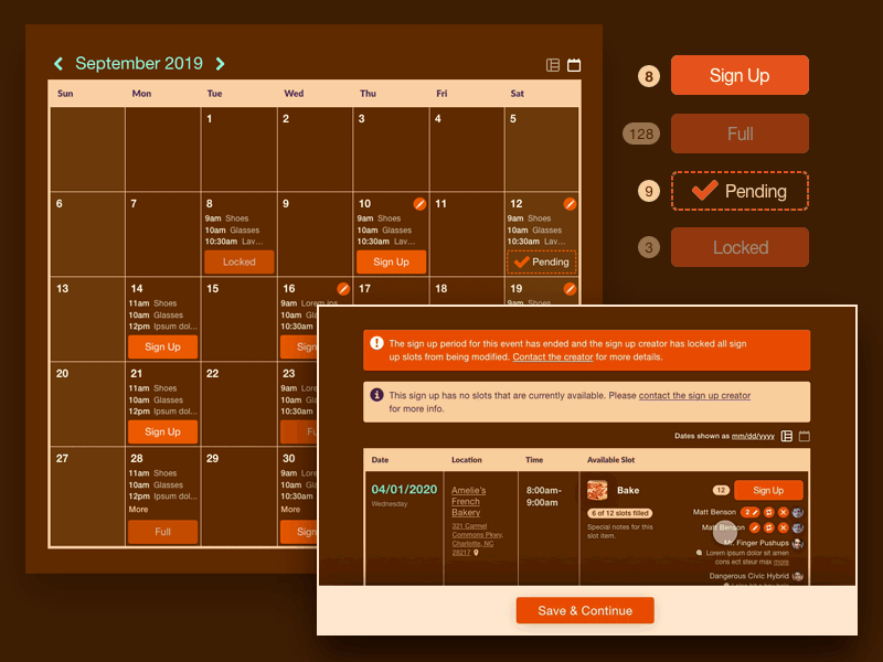
Here are some suggestions to make it more digestible AND keep the development investment minimal (no overhauls — use existing structures, schemes, components, and markup when possible, etc.)
1) Show system status; give participants feedback on what they're signing up for. Make the choices clear. Buttons should give feedback.
2) Simplify language and reduce errors by presenting only relevant options. Use microcopy and tooltips more.
3) Clean up that calendar; use beginning times and a brief comment. Remove all the superfluous punctuation and brackets, they don't add anything other than occupy more space.
4) Sticky those column headers in the grid layout so nobody gets instantly lost when they scroll down. Better yet, are all those columns are needed? Smarter groupings and hierarchy would likely be clearer.