DC Comics Logo

When I first saw the latest DC logo in 2016, I was underwhelmed.
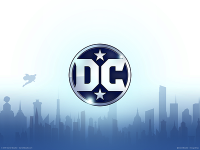
I decided to take a crack at improving the logo myself, creating a clear symmetry between the “D” and the “C.” The circle left negative space that could easily fit a star above and below the letters, bringing back an element that defined the logo for so long. Finally, I made sure the angle of the outer diagonals (seen most clearly on the “C”) matched the diagonal lines of the stars.
With a little nudge, this new logo has a distinct look that builds on DC's long history while keeping it simple enough for its endless applications.
Read the full article:
https://medium.com/@DanielBeadle/logoshop-part-1-dc-comics-dd1b95282c85
Download the logo wallpaper pack:
https://gum.co/dcwallpapers
Download the character wallpaper pack:
https://gum.co/dccharacterwallpapers